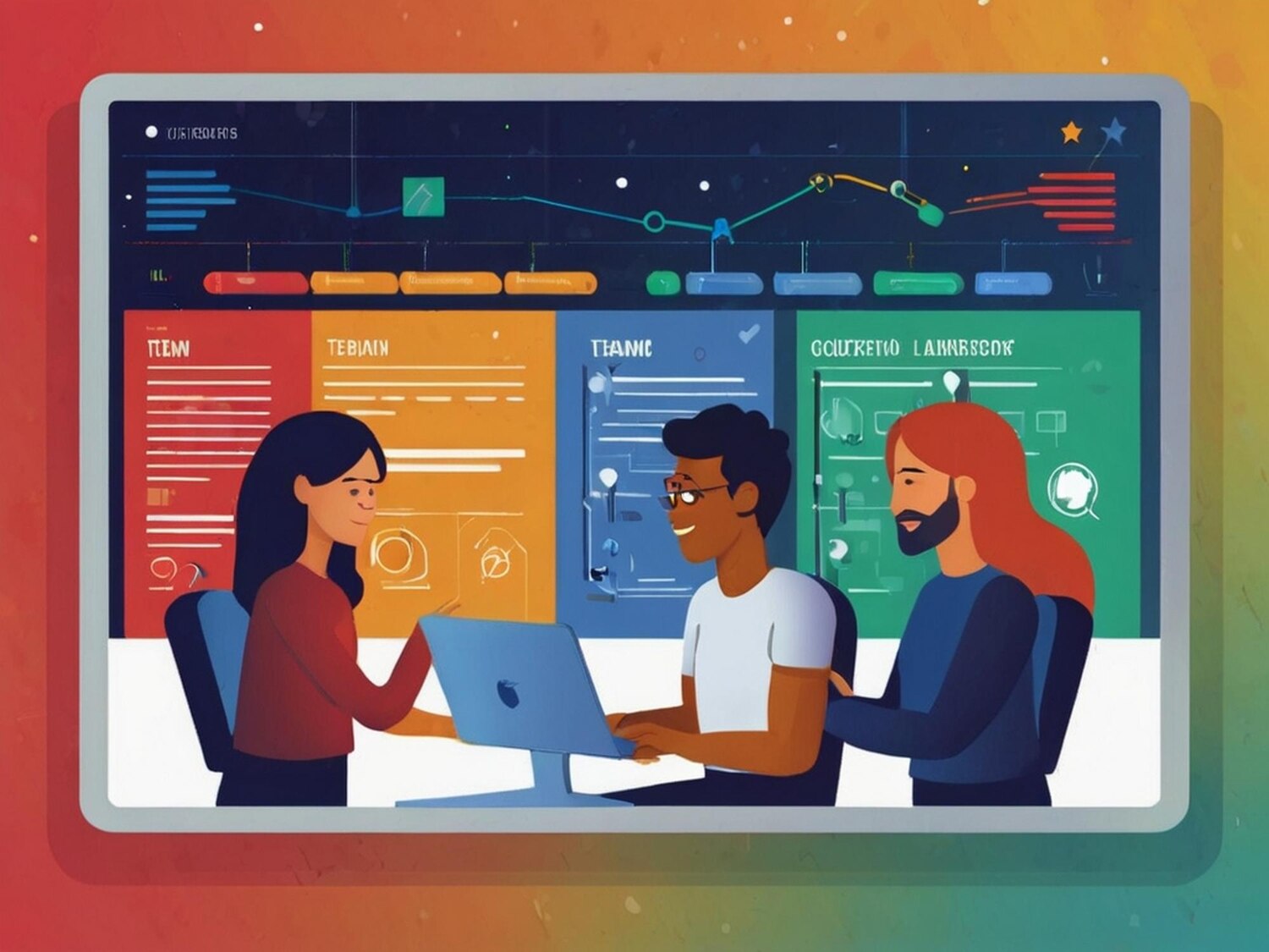
Visual Identity Design That Scales Across Products

Visual identity design isn’t window dressing; it’s an operating system for your brand. After two decades building identities that have to work inside real products, across complex organizations, and under brutal delivery deadlines, I’ve learned a simple truth: the brands that outperform treat identity like infrastructure. Not a poster, not a mood board, not a single moment of inspiration—a durable set of rules that make decision-making faster, quality more consistent, and growth less risky. If what you need is a pretty logo, you can stop here. If you need a system that can flex from pitch deck to product UI to a hectic launch day without breaking, read on. I’ll show how visual identity design connects strategy to execution, where teams typically fall down, and how to measure impact with the same rigor you’d apply to an engineering roadmap.
Visual Identity Design Isn’t a Logo: It’s a System
Logos are shorthand; systems are engines. A logo can evoke meaning, but without the surrounding rules—type, color, motion, spacing, grids, and use cases—it’s just a mark floating in space. In practice, visual identity design translates positioning and personality into a toolkit that any competent designer, developer, or marketer can apply under pressure. That toolkit should reduce variance, cut production time, and raise the floor on quality. When a brand needs to move fast, teams don’t have time for taste debates or endless micro-decisions. A strong system resolves 80% of choices in advance, letting people focus on the 20% that truly differentiates.
Over the years, I’ve seen the same failure pattern repeat: a shiny rebrand launches with applause and then collapses in the wild because no one defined behavior. How does the identity compress into a mobile header? What happens to color on low-end displays? How does motion look at 12fps on a budget device? Visual identity design only works when these edge cases are considered up front. We document not only how things should look on ideal canvases but also how they degrade gracefully across real environments, including legacy systems and third-party integrations. Without that realism, the identity becomes a liability the minute it meets production.
Success starts by reframing identity work as a product. You have requirements, constraints, acceptance criteria, and versioning. A robust design system is testable. It should provide guidance that is explicit enough to prevent drift and permissive enough to allow growth. That balance—the tension between order and adaptability—is where the craft lives.
Strategy Before Color: Positioning That Drives the Palette
Color and type are consequences of strategy. Before a single pixel moves, I want a clear positioning statement, audience definition, and a set of proof points the brand can credibly own. From there, personality attributes translate into design directions. A B2B data platform promising reliability and clarity won’t share the same visual identity design language as a consumer fintech brand built around empowerment and momentum. The same goes for competitive context. If three rivals own safe blues and geometric grotesks, you either zag decisively or accept parity and compete elsewhere.
Strategy must be written in plain language, not research jargon. Give teams simple, memorable traits they can reference under deadline. I prefer a stack of three: a lead attribute (what you must always exude), a supporting attribute (what you should often express), and a contrast attribute (what keeps the identity from feeling one-note). Those map to tangible levers: speed and direction for motion, density and rhythm for layout, warmth and contrast for color, and detail and hierarchy for typography. The mapping is direct and actionable, eliminating the subjective fog that bogs down sign-off.
To ensure the strategy survives contact with the real world, we prototype early. Not just fancy hero shots—real artifacts: product screens, onboarding flows, pricing tables, and error states. Seeing strategy stress-tested in a product context protects the identity from the “campaign-first” bias that ruins usability later. It’s also how you earn leadership trust: by demonstrating, not declaring, how the system supports outcomes.
Building the Core: Logos, Wordmarks, and Motion Marks
Core marks do the heavy lifting, yet they’re often over-engineered. I aim for a logo that is legible at 16px, reversible on dark and light backgrounds, and resilient in one color. If it fails any of those, it fails the business. Wordmarks deserve equal care: kerning tuned for both print and pixel grids, with an alternate lockup for tight spaces and a monospaced or tabular-number version for technical contexts when alignment matters. Add a motion mark if your brand lives in product—micro-animations that reinforce personality at key touchpoints like loading, success, and confirmations.
Remember constraints vary by channel. Social avatars cut detail. App icons compress shapes into unforgiving bounding boxes. On web and product UIs, favicons and headers reveal how well the mark navigates scale and contrast. Provide a set of lockups with usage rules strong enough to avoid Frankensteins but flexible enough to accommodate future surfaces. That means ratios and safe areas are defined, not just shown once on a grid. It also means documenting optical adjustments for small sizes, like thickening strokes or simplifying counters.
Finally, prototype motion with production reality in mind. That elegant 400ms easing curve may feel syrupy on older devices and verbose in workflow-heavy apps. Specify durations and easing families by context: expressive motion for marketing, functional motion for UI. The logo isn’t an art piece; it’s a component inside a broader visual identity design system that must respect performance budgets and accessibility.
Type, Color, and Layout as Operating Rules, Not Art
Type is your voice. Treat it like one. Pick a primary family that scales across long-form reading, UI labels, and data tables; if you need range, add a secondary family for personality hits or a monospace for technical credibility. Define typographic scales as tokens, not ad hoc sizes—names like t-100, t-200, t-300 that map to rem values and line heights. Provide explicit guidance for numbers, fractions, and symbols. If your product is data-heavy, tabular lining figures are not optional.
Color deserves the same rigor. Build palettes with semantic roles—primary, surface, text, interactive, success, warning, danger—rather than only brand hues. Then define states: default, hover, active, focus, disabled. Bake in accessibility from the start with WCAG contrast thresholds, and show tested examples, not just ratios. A vivid brand color can still headline your marketing while a tuned interactive palette keeps UI legible and calm. Both can be true when you separate expression from function.
Layout principles finish the picture. Establish spacing tokens and grid behavior that scale from mobile to widescreen. Define rules for density modes, empty states, and error handling. Document specimen pages that mimic reality: a pricing table with footnotes, a support article with nested lists, a dashboard with charts and filters. That’s where the system earns trust—by performing well under the messy conditions teams face every day.
Visual Identity Design for Digital Products and Websites
Most identities fail where they matter most: in the product and on the site. The handoff from brand to build is where entropy takes over. To prevent drift, translate brand assets into a live design system that product and marketing both use. Tokens, components, and templates should be the single source of truth, expressed in design files and code. When your website and app teams align, campaigns land cleanly and user experiences stay coherent through releases.
Implementation speed matters. If you’re rebuilding your site, bake the identity into a modular architecture from the start. A partner with both brand and build expertise can compress timelines and reduce rework. When your team needs a ground-up platform aligned to the system, consider engaging specialists in website design and development alongside custom development to ensure the design language survives the repository. The best identities feel inevitable in code—no one-off CSS hacks, no mystery variables, no special cases that break during sprints.
Performance and accessibility are identity issues too. Excessive motion, unoptimized media, or low-contrast text damages both usability and brand credibility. Put budgets in the guidelines: target LCP and CLS thresholds, define motion-reduction behavior, and specify fallbacks for rare fonts. When you treat visual identity design as part of your product system, stability replaces guesswork, and teams stop reinventing patterns to meet ship dates.
Governance, Tooling, and Hand-off: How Teams Keep It Consistent
Consistency doesn’t happen because you asked nicely. It happens because you made the right thing the easy thing. Start with governance that respects how your organization actually ships. Appoint a small brand council with representation from design, product, engineering, and marketing. Their job is to approve changes, prioritize requests, and protect the system from ad hoc exceptions. Add contribution paths for teams to propose improvements, with clear acceptance criteria and versioning. A changelog is not a luxury; it’s how downstream teams keep pace.
Tooling is where most programs either sing or stall. Keep tokens in a repo, not a PDF. Publish guidelines to a living site with code snippets, usage do’s and don’ts, and downloadable assets. Use CI to validate color and type tokens against contrast requirements. Automate asset generation for logos and social images. Engineers should be able to import the brand the way they import any dependency, and designers should be able to pull components from a library that mirrors production. When design and code drift, ship velocity and brand quality both suffer.
Hand-off is as much about people as files. Provide training for new hires, office hours for teams, and a support channel for edge cases. Reward adherence publicly—recognition matters. Visual identity design thrives when teams feel ownership and when contribution is safe, fast, and reviewed by peers who care about outcomes, not pedantry.
Measuring Brand Impact: From Recognition to Revenue
Brand work without measurement is faith. You can quantify impact without reducing identity to vanity metrics. Start with recall and recognition studies to validate distinctiveness. Then connect to product and revenue: does the new system improve conversion, reduce time-to-ship, or cut design debt? Track design system adoption rates, component reuse percentages, and the reduction in bespoke patterns over time. If teams are cloning fewer one-off variants and spending less on last-minute fixes, you’re creating value.
Instrumentation helps. Tag components and templates in your site and product to correlate usage with outcomes. Site performance improvements from better typography and media handling often tie to SEO gains and higher engagement. A robust partner in analytics and performance can connect design decisions to measurable KPIs—LCP, bounce rate, funnel completion—so stakeholders see the line from visual identity design to growth.
Qualitative signals still matter. Sales calls become easier when decks feel cohesive and credible. Customer support gets fewer “can’t read this” complaints. Recruiting benefits because candidates judge your competence in seconds. Bring these anecdotes into your retros. Numbers convince the CFO; stories convince everyone else.
Rebrands vs. Refreshes: A Decision Framework
Not every problem warrants a full rebrand. If positioning is sound and equity is strong, a refresh can modernize type, expand color, and tidy behaviors without burning brand memory. Choose a rebrand when you’ve shifted strategy, entered a new market, merged, or need to decisively distance from negative equity. Otherwise, a rigorous refresh—often paired with a design system overhaul—delivers 80% of the upside with a fraction of the risk.

Use a simple decision tree: Are you changing who you serve or how you win? If yes, a rebrand is on the table. If no, assess the gaps: inconsistent use, inaccessible color, missing tokens, or outdated assets. Those are signals for a refresh plus systemization. To ground the choice, run a compact discovery—competitive audit, stakeholder interviews, and brand-UX mapping. Resources like the Nielsen Norman Group’s guidance on brand and UX provide a solid framework for aligning experience with brand promise.
Risk management is part of the call. In regulated categories or with entrenched user bases, a full rebrand can create friction and cost. A phased refresh avoids disruption while still closing gaps. Visual identity design is a lever, not a stunt. Use it to reduce friction, signal maturity, and create coherence—then keep shipping.
The Roadmap: Phased Implementation Without Burning the House Down
A good plan respects capacity. Start with high-visibility, low-dependency assets: decks, docs, social templates. Next, update the website’s global styles, typography, and navigation—foundations that lift every page. Parallel-track the product design system with tokens and a core component set. Only after the base is stable do you tackle complex templates and deep product modules. This cadence shows progress early and prevents rework from trickling across a dozen teams.
Integration unlocks compounding returns. Automation for asset delivery keeps new logos, icons, and illustrations from drifting. Consider a partner with expertise in automation and integrations to wire asset pipelines into your CMS and repositories. If commerce drives your brand, bring the system into your catalog, PDPs, and checkout with a thoughtful rollout led by e‑commerce solutions that balance conversion with brand expression. For bespoke needs—feature-flagged experiments, complex dashboards, or APIs that surface brand elements—align early with custom development so launch dates don’t slip.
Don’t skip documentation and training. Publish a living site, hold workshops, and resource a small core team to maintain momentum. If you need a specialist to stand up the foundation fast, bring in a focused crew for logo and visual identity who can translate strategy into a shipping system. A disciplined, phased plan turns visual identity design from a risky big bang into a steady drumbeat that compounds brand equity while the business keeps moving.